Vitra
Brand strategy, Branding, UX/IU Design, UI/UX Development, Motion design, 3D Visualization
VisitVitrA's Digital Brand Identity Transformation
Bridging the Online-Offline Divide
In the transition from the tactile, infinite variability of the physical world to the precision-driven, binary landscape of digital spaces, traditional brand identity guidelines often fall short. This case study illustrates our journey with VitrA to redefine these boundaries through a digital-first brand identity guideline, highlighting the imperative shift needed to thrive in the digital ecosystem.
The Digital Paradigm
The shift from conventional to digital necessitates a reevaluation of brand identity principles. In the offline world, brand elements enjoy a certain fluidity, with colors and sizes adapting seamlessly to various materials and contexts. Contrastingly, the digital world operates on absolute values—pixels, RGB color models, and screen resolutions—demanding precision and consistency. This discrepancy underlines the need for a digital-first approach, ensuring brand integrity across all digital touchpoints.
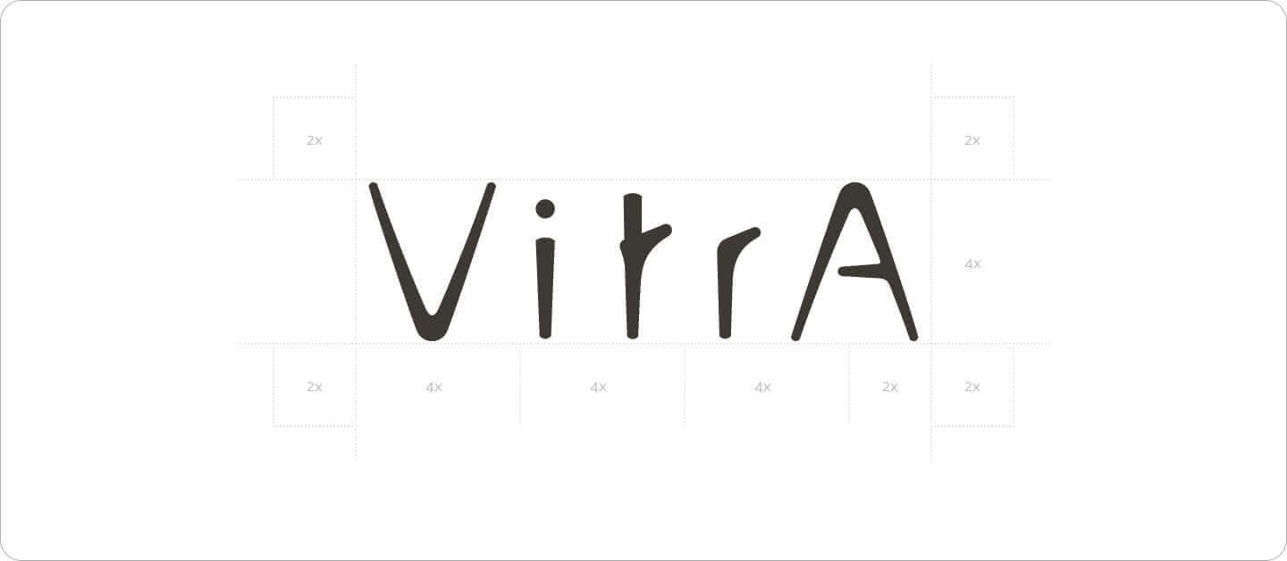
Logo Guidelines: A Formula for Scalability
Central to our strategy was the creation of a scalable logo formula, ensuring VitrA's logo maintains its integrity across the vast array of digital platforms. We devised a formula where, under the condition that X is greater than 2, the logo's height equals 4X and its width 14X. This method not only facilitates pixel-perfect scaling but also accommodates the diverse array of digital display sizes, from the smallest mobile screens to the largest monitors, without compromising on clarity or proportion. Each logo variation adheres to W3C accessibility standards for color contrast and is optimized for gradient backgrounds to prevent degradation. Furthermore, we defined specific rules for favicon adaptations, ensuring brand recognition in browser tabs.
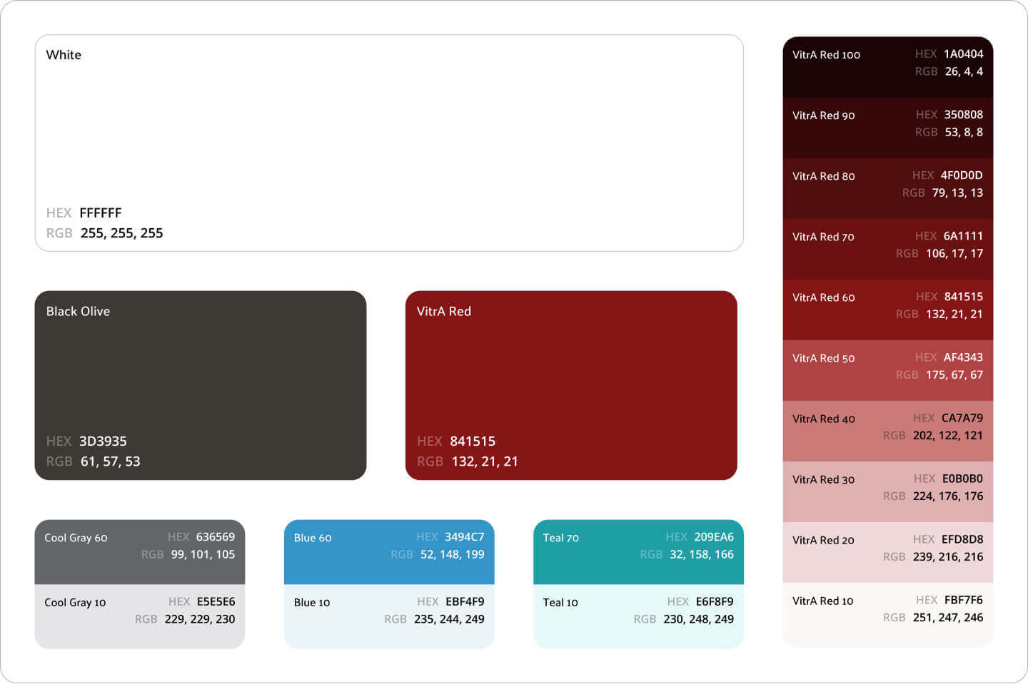
Color Guidelines: Adapting to Digital Realities
Our transition of VitrA's color palette to the digital realm involved not just a translation of existing colors, but a reimagining suitable for digital displays. This adaptation accounts for the differences between subtractive color models used in print and the additive color models of digital screens. We meticulously crafted a palette that remains faithful to VitrA's brand identity while ensuring optimal visibility and compliance with W3C digital accessibility standards.
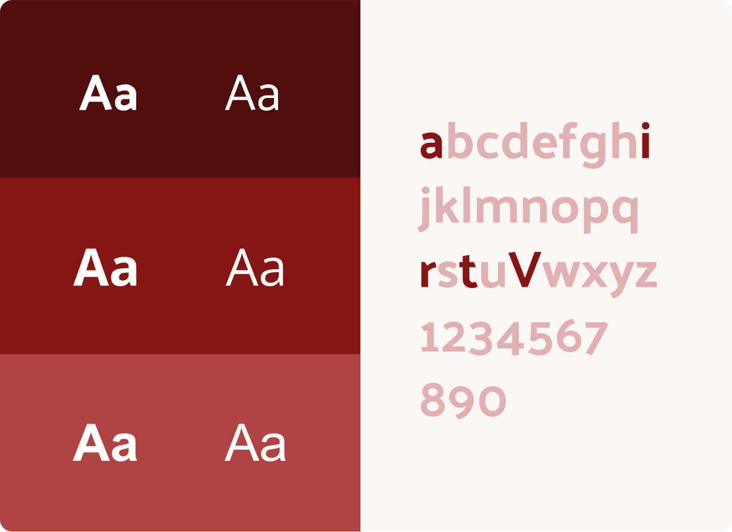
Typography: Crafting Digital-First Rules
While VitrA's font families were already well-established in their conventional brand guidelines, our task was to transition these existing choices into the digital realm effectively. Recognizing the unique constraints and opportunities of online platforms, we meticulously crafted rules for the digital use of VitrA's fonts. This included detailed guidelines on font rendering, sizing for readability across devices, and establishing a fallback system with system fonts to ensure no user is left behind due to technical limitations. Our approach guarantees that VitrA’s textual presentation is consistent, accessible, and elegant across all digital touchpoints, upholding the brand's prestige in the digital landscape.
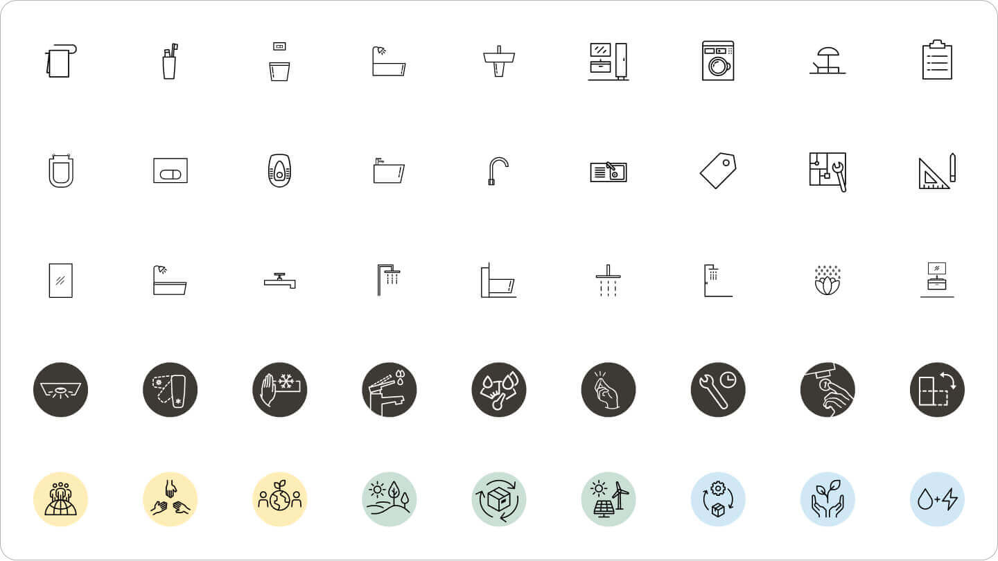
Iconography: Tailoring for Digital Platforms
We reimagined VitrA's icon suite for the digital age, drawing each icon with precision and consideration for digital environments. Our guidelines cover line thickness, responsive versions, and accessibility standards, ensuring that icons are clear and communicative at any size. We categorized icons into product, technology, application, sustainability, and interface groups, redrawing each in three sizes (24dp, 48dp, 64dp) for scalability and clarity.
Animation: Crafting Digital Dynamics
Animations breathe life into digital experiences. Our guidelines for VitrA detail timing, easing, and the physical feel of animations, ensuring they are engaging yet intuitive. We emphasize animations that enhance user experience without detracting from usability or performance.
This comprehensive approach to digital brand identity for VitrA not only enhances the brand's digital presence but also sets a new standard for digital brand guidelines. By addressing the unique challenges and opportunities of the digital landscape, we've created a scalable, accessible, and cohesive identity that VitrA can confidently deploy across all digital touchpoints.
This case study serves as a testament to the importance of digital-first brand identity guidelines in the modern era, showcasing our commitment to innovation and excellence in digital design.